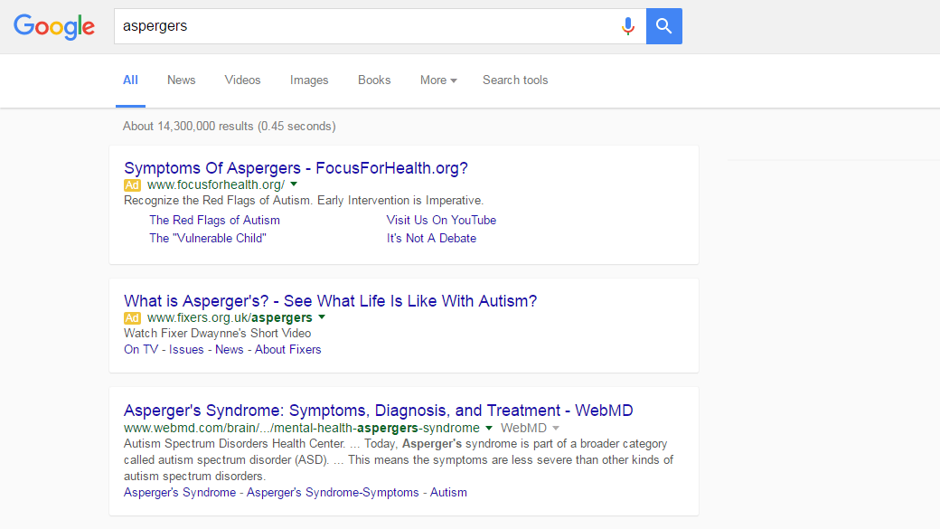
Google continues to experiment with new layouts for its web search page and other search properties, Digital Inspiration says, which sighted a design of a single column layout with sidebar options now placed between the search box and search results. “There’s plenty of whitespace between search results and links to the cached version of pages have been removed in the new design,” it said.
Another change was the footer, the Digital Inspiration post, which included screen captures of the page, also said. The footer’s navigation links are now in plain text and the Google image is gone. This new design appeared briefly on DI’s screen early Wednesday.
Another Trial Balloon….?
Google clearly has been tinkering with its search page layout for some time. Earlier this year, tech media seized on tests the search engine made – tests that sound very similar to what DI saw. The pages spotted were cleaner, the colors more crisp and there was more of Google’s trademark white space. The underline under the search results had disappeared as did the familiar “cached” and “similar” links. Instead, there were dotted lines separating each search result and the spacing between a page’s headline and its description.
…Or Is There A New Ad Format Coming?
One theory is that this new format might be in the works in order to support additional ad products, or at least retooled versions of the ones it already offers. The overall thrust of the changes makes one “feel as if the results are actually more considered and accurate,” offered a CNET blogger when the last wave of tests were sighted.
Also, the additional white space gives Google the leeway to experiment with different types of ad formats, it noted. Of course this is hardly the first time Google has experimented with the look of its page — and oftentimes it was just that, an experiment.
Last year, for instance, it introduced a series of colorful photos that dominated its usually sparse white page. The Doodle briefly went missing too, much to many readers’ ire.
There have been other times, though, that such “sightings” have turned out to be eerily prescient. Earlier this year MarketingVOX pointed to Google Operating System’s blog post that described a broken link with “business profiles” as the anchor text that it spotted in the source code of the Google Profile page.
“The link sends you to a page that doesn’t exist – http://www.google.com/_/managepages – but this feature could add Google Profiles to Google Apps and allow users to create multiple profile pages,” GOS wrote.


